Google's productivity apps just got their scheduled makeover.
The California-based search giant recently launched the updated user interfaces (UI) of many of its productivity apps, allowing users to access their features more easily than before.
The new UI coincides with Google's efforts to fit many of its services with its Material Design 3 language, per The Verge.
Google Productivity Apps New UI Details
Google mentioned in its announcement post that it has "streamlined" the UI of many of its productivity apps, such as Google Docs, Drive, Sheets, and Slides, with less clutter and a few improvements and additions. This new UI makes the productivity apps look similar to Gmail's UI, a sensible move considering the company's Material Design 3 language.
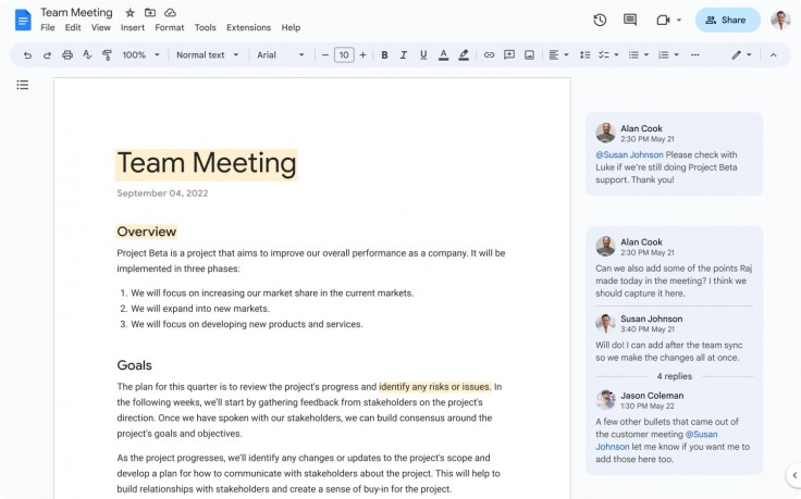
Firstly, the search giant launched a simplified UI at the top of users' docs, sheets, and slides to help them find frequently used actions faster. According to 9to5Google, these frequently used actions, including the usual dropdowns found in the old UI, are contained in a pill-shaped light blue toolbar.
As a result of this change, the top bar (with a blue sharing pill and buttons without containers at the right) and most of the page share a very sparse background in Docs, though this minimalistic feel isn't as prominent in Sheets and its cells.
Google also added more user experience improvements in commenting, background, rulers, and gridlines, providing more utilities to users to help them become more productive.
Google stressed that though it made no changes in the apps' productivity, it relocated some features to reduce clutter within the new UI. As such, users can find the latest status info for a document, such as last edit and version history, through the clock icon in the top right corner.
Secondly, Google made Drive's key actions surfaced inline on files to provide users with quick access to their files and increase their productivity. This change means that users can see the shortcuts to share, download, rename, and open the menu usually accessible by right-clicking through hovering over a file in the list view.
Additionally, users can now select multiple items at a time and manage batch operations for frequent tasks, such as share, download, move, and remove. Lastly, Google Drive users can now see a new feature called search chips (or sort orders) to help them find files faster. These chips include type, owner, and last modified.
Google Productivity App Availability Dates
Google mentioned that it would gradually roll out the new UI over the next 15 days for users on rapid release domains starting on Mar. 6, while those on scheduled release domains will get a full rollout in a day or over the next three days starting on Mar. 22.
These UI changes are available to all Google workspace users and legacy G Suite Basic and Business customers. People with personal Google accounts can also enjoy the new UI of Google's productivity apps.
Related Article : LoL Patch 13.6 To Soon Add Support Champion Milio to Roster


